
The idea behind a sales funnel is to steer your visitors in the right direction and help them decide to make a purchase. But a sales funnel cannot work by itself; you will still need to employ all the marketing resources at your disposal.
From landing pages to the website members’ area, Clickfunnels is an excellent tool to boost your sales. In fact, it is 100% doable to build a funnel on clickfunnels in minutes.
Before you create your own funnel and start generating more sales, it pays to take a look at the top Clickfunnel examples.
What Is Clickfunnels: And How To Use An Example?

Clickfunnels is a robust landing page builder, shopping cart, and membership platform.
You can run your entire business on it.
When you look at these landing page examples, the goal is not to copy them…
Find one that matches your business goal, and you have a starting place. It’s more simple and fast than starting from a blank page.
Crush your business goals with these top landing pages that are perfect examples for a high converting clickfunnel.
19 Best Landing Page Models – Perfect Clickfunnel Examples
SamCart
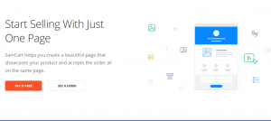
SamCart excels when it comes to maximizing sales. There are subscriptions, one-click upsells, order bumps, and different payment plan options. The thing is, none of this is overpowering for users… and the funnel sports minimalistic page design and straightforward copy.
The site features a pop-down banner to check the latest updates. There are snippets of how SamCart helps improve businesses, and these include numbers and stats. However, the demo is opt-in, which is not necessarily a bad thing.
ConvertKit
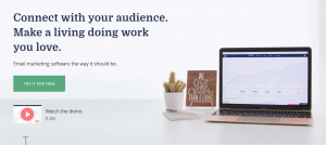
If you want a good example of a frictionless sales funnel, you need to check out ConvertKit. The funnel consists of four stages: a lead page, two survey questions, and the sign-up. For inexperienced marketers, this might seem like overkill… but looks are deceptive.
Filling out the survey question makes the users feel that they are getting a customized service. This also incentivizes user interaction and makes the process more personal. There is also a 95-second video right below the first CTA button that explains how to use the platform.
Social proof is sprinkled around the homepage, but it could benefit from more than one CTA button.
Grasshopper
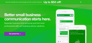
Grasshopper offers app-based business telecommunication services with the focus on different types of numbers, business texting, VoIP, etc. As for their sales funnel, it works like this: The traffic is drawn from ads, blogs, and PR. The visitors land on the homepage, the features page, or the pricing page.
The pages are well-laid-out and minimalistic with strategically positioned CTA buttons. Since the company started, they have tested and tweaked the original design to create one of the most streamlined funnels out there.
However, the one-month money-back guarantee would use additional explanation. And the homepage copy could focus more on the unique values the company offers.
Planscope
This project management tool stands out as one of the best clickfunnel page examples. The ones that truly grab the eye can be found in the Planscope dashboard tour. This is a set of pages that guide the visitors through all the features and provide first-hand experience of how it all works.
The catch is in the simplicity and value-driven content. The visitors get a clear understanding of what they are getting, plus there are numerous instructionals along the way. Bear in mind, all of this is easy to follow and the user experience is not overwhelming.
The one weak spot of this platform is the support page called the Knowledge Base, but it can be improved with a design overhaul.
Perfect Audience
The Perfect Audience funnel found its way into this list because of great CTAs and social proof about the service’s effectiveness.
In fact, the Overview and Case Studies pages give you a snappy explanation of how Perfect Audience clients used the service to its full potential.
All statements are supported by numbers, and you get an insight into the client’s goals as well as the final results.
There is a CTA button at the end of each page, and the visitors get a clear idea of how Perfect Audience would fit their niche.
However, it’s not that easy to find the pricing page. The 14-day trial is a good hook, but most visitors like to check the prices before starting the trial.
Help Scout
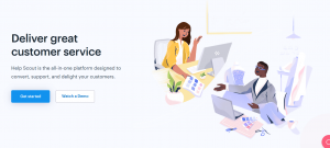
Looking for great clickfunnel website examples? Help Scout will surely charm you with its design and clever use of colors and graphics. Beyond the design, the company sends out a clear message about what to expect and the Help Scout blog is hard to rival.
That being said, it would be great to have a diagram or a graph that shows the service’s inner workings. It offers many different tools and features, so an explainer video or diagram on the homepage would direct users to all of its good sides.
On a positive note, the Help Scout CTA buttons are very well positioned.
Mint
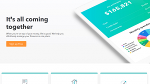
Mint’s core service is financial data tracking and they operate as a business-to-consumer site. The company offers the proprietary app for free and the focus is on signing up as many users as possible.
As for the layout, the fold is below the CTA and everything looks clean, simple, and trustworthy.
The sign-up buttons appear at the top and bottom of every page and the visitors know exactly what they are getting. When you combine the two, the click-through rate is likely sky-high, but the headline is one thing Mint could improve.
At the time of this writing, the “coming together” thing doesn’t seem to collocate with the service and its benefits.
Groupon
Groupon is one of the top clickfunnel button examples. The CTA buttons are clear, rather large, and carefully positioned throughout the pages. The website and the pages draw the visitors’ attention and they’ve been polished to perfection.
Combine the buttons with unobtrusive sign-up pop-ups and you get a winning combination that can yield thousands of emails.
Groupon is email-driven and the trick is to find the balance between pop-ups and CTAs to avoid scaring off potential clients.
The downside is that you don’t really know what to do next after the sign-up, meaning that the user experience should be more streamlined.
CrazyEgg
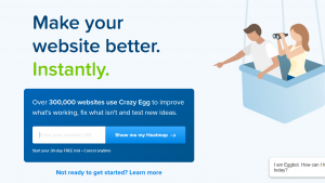
This sales funnel is really big. From user-friendly informative blog posts to the clear and simple pricing page, Crazy Egg is designed for high conversions. The copy provides valuable snippets of explanations that are of value to the potential users without being overbearing.
In addition, Crazy Egg incorporates eye-catching visuals that provide a glimpse of the service in action. As for the CTAs, they appear at the end of every blog post and there’s the main CTA on the homepage.
Truth be told, there is very little to complain about with Crazy Egg. Some of the marketing copies could be more streamlined, but then they do include helpful visuals.
Basecamp
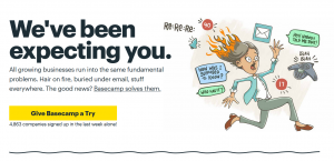
Follow Basecamp for some time, and you’ll realize the design keeps changing as the business grows. The company seems to be doing a lot of A/B testing to determine the layout, copy, and visuals that convert. Speaking of visuals, the cartoony graphics are indeed one of the main assets.
What’s more, social proof or case studies are presented in a distinctive way. You can see the user’s name, company, and a snappy quote about how Basecamp helped. All this makes the entire experience feel more personal and steers users to the major takeaways.
MailChimp

MailChimp is at the very top of clickfunnel examples. The homepage is simple and it features an inviting copy and a clear CTA button. The yellow background, black font, and deep blue accents do wonders to capture visitors’ attention and direct them to the sign-up page.
Plus, the company employs a neat trick to spread the good word. The basic subscription is free and lets you send out an email blast to 2,000 addresses. Each email in this plan has a MailChimp signature at the bottom which puts the service in a viral loop.
Interestingly, there is little to no information about growing business with this service and it could use additional social proof on the pages.
Leadpages
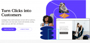
Being a landing page builder, the Leadpages product takes the center stage in the overall funnel layout. The main asset is a 90-second demo of the features and how to take advantage of them. This company also provides one of the best examples of clickfunnel webinar registration.
The webinar page is under Resources on the homepage and it’s also a prime example of a good copy. There’s no guessing about the webinar duration and what you are getting. The page offers a quick explanation of the curriculum, and it stresses the fact the webinar is designed for people with limited programming skills.
The thing that could be improved is the purchase sign-up form. It is a bit too long and might be off-putting to privacy-conscious users.
Drift
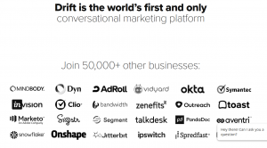
With all great clickfunnel examples, cleaning the homepage of clutter seems to be the common design tweak. The live-chat Drift service is a great example of a super-minimalistic homepage that converts.
It has a white background, black font, and a great headline. The registration bar and button are hard to miss and Drift uses large employee images to make the experience more personal. As you scroll, you find visuals to help you understand the process and benefits, plus there’s a preview of DriftBot in action.
Despite being minimalistic, the Drift funnel utilizes colorful triangles and lightning to steer your attention to the main features.
Wufoo
Clear copy, good branding, and a nice explainer video are the features that make the Wufoo funnel stand out. You’ll notice that the copy uses casual language which makes the experience more welcoming.
Wufoo also has clickable icons. They are there to create a more interactive demo, but it’s not immediately clear that you can actually click on some of them. Wufoo also highlights the freemium offer and provides a clear explanation of its limitations.
Moz
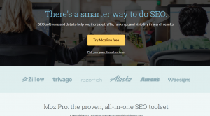
Compared to most other funnels, the Moz copy is a bit jargon-heavy. But then, they do target SEO professionals and experienced marketers. More importantly, Moz found a clever way to incorporate social proof into the copy to give credence to the service’s effectiveness.
However, the CTAs don’t appear to be the funnel’s strongest suite. The features and pricing page didn’t have any CTA buttons at the bottom at the time of this writing. And the buttons that appear in the upper section are easy to miss.
It’s safe to assume that adding another button at the bottom and somewhat simpler lingo could attract more customers.
AutoGrow
As a lead generation funnel service, AutoGrow ticks all the right boxes in terms of design, CTAs, and page content. Above all, it’s clear what the customers are getting right off the bat. The monthly subscription is a bit pricey, and the visitors understand that right away.
The pages include snappy explanations and a lot of social proof. The great thing about AutoGrow is that it incorporates videos of their clients talking about their user experience.
The CTA buttons are strategically positioned throughout, and there is no way to miss them. The quick demo that improves the conversion rates is the main asset.
Mixergy

Mixergy has made information gathering into an art. This course platform doesn’t beat around the bush; there is a huge CTA button on the home page, and users provide information in return for a video. Of course, up-sale messages follow soon after… and Mixergy has found a good formula to avoid spamming the users.
The premium account payment form is designed to reduce friction, but Mixergy seems to have taken it a step too far. There should be more fields for different paying options, and the security logos should be clearly visible to give the users a peace of mind.
Harvest
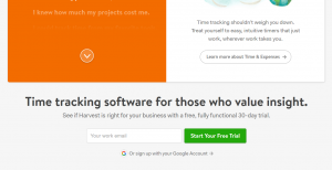
Once you look beyond its simplistic design, you’ll realize that great social value is among the top-selling points of Harvest. The user testimonials are woven with the explanations and description, plus there are several CTAs and it all feels inviting and friendly.
In addition, the pages feature interactive elements and cool graphics that support the copy.
This creates a straightforward UI, and this funnel is among the easiest to use. However, the Harvest pricing page would benefit from a more streamlined and user-friendly design.
Netflix
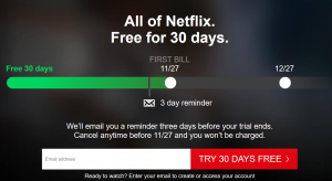
Without a doubt, Netflix owes a lot of its success to the expertly executed sales funnel. The home page greets you with a brief explanation of the risk-free trial period. In fact, one of the main selling points is that you can cancel a subscription at any time without hidden costs.
What’s more, the pages are super-simple with minimal text snippets, yet they don’t leave the users guessing. Once you click on the sign-up button, you are directed to a straightforward 3-step process that requires only the necessary information.
However, the pricing page and homepage are somewhat incongruous. The former has a white background and the latter has black. This is a good example of something that would be worth A/B testing.
Start Funneling Cash Today
Aside from the models in this article, there are also great clickfunnel eBook examples. Without going into too much detail, it all boils down to intuitive UI, minimizing friction, and strategic positioning of the CTAs.
And don’t forget, the trick with most clickfunnel examples is to put your design through a rigorous A/B test. This way, you’ll gather invaluable information to further optimize the site.