
If you think writing a killer ebook is enough to generate leads and get conversions, you need to think again. How are people going to download it when they don’t even know much about it? Want more people to download, love and even SHARE your ebook for you? Then it’s time to create a custom landing page so that people can learn more about your ebook and eventually download it. In this article, you’ll learn the art of creating an effective ebook landing page. You’ll also find lots of actionable tips and tricks to skyrocket your downloads by offering an exceptional user experience. Let’s get rolling.
What is a Landing Page and How Does it Work?
Before we jump into the nitty-gritty of creating a landing page for your ebook, let’s take a look at what it actually is and how it works. A landing page is an individual page on your site that’s designed particularly for the purposes of a marketing campaign. It’s where a visitor “lands” when they click on an online ad. Also known as the opt-in page, it often includes a lead magnet that attracts visitors to sign-up and send their email address in exchange for a freebie. When designing landing pages, there’s just one focused objective: To drive action. Now this action could be anything, from subscribing to a business blog, to filling out a marketing survey form, to submitting your email for a free ebook. Each landing page has a specific Call-to-Action (CTA).
What Should Be on A Landing Page?
So, what sets a ‘good’ landing page apart? Here are a few things you should consider adding on your page to make it stand out from the crowd. Your Offer First off, you need to have an offer which can be an ebook, a checklist, or a free webinar. Your offer must be useful and relevant to your target users. A Persuasive Headline Did you know, a whopping 80% of people read the headline, but only 20% of them read the rest? Now you can imagine how an unappealing, cold headline can shoo your visitors away! So, consider adding a persuasive headline that compels visitors to read further. Typically, “number” headlines resonate more with readers, followed by “reader-addressing” headlines. 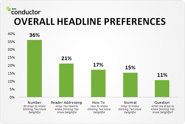 Also, add a section explaining how your offer provides sufficient value to convince your users to send you their information. This section can include bullets to detailed benefits. Your Offer’s Image Another essential element that you should be adding on your page is your offer’s image. People would obviously like to see what your offer looks like before hitting the CTA button. A Form Consider adding a form to capture your users’ email addresses and relevant information (like their name, company name, questions about persona qualification, business questions etc.). These forms help you with lead generation as well as other marketing efforts. Here’s the example of a landing page. Check out how different elements are crafted.
 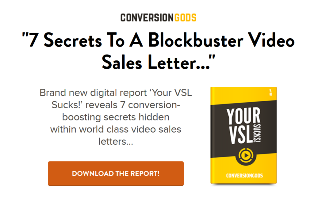 A ‘Thank You’ Page A Thank You page appears once your visitor completes the form and clicks on the CTA. It lets you deliver the promised offer and restore navigation to the rest of your website. You can also include additional CTAs here, such as a call to subscribe to your business blog, or to download another related offering. Here’s a bonus tip: Including a limited-time offer or a flash sale can increase your ebook sales. Just by adding a countdown timer, you can experience an 8.6% lift in conversions! Many people add the thank you message within their landing page. But, it’s not a perfect approach because:
- You can’t measure the performance of your landing page. The objective is to reach the thank you page, which can be measured via Google Analytics or any other analytics software.
- It gets frustrating for your prospect and he/she feels stranded as the page doesn’t include website navigation.
- You lose the chance to further nurture your relationship with the lead by offering next steps.
Here’s an example of a separate Thank You page on the Digital Marketer website:  Fewer Links Unlike your homepage, your landing page should have fewer links to reduce distractions. This helps increase your conversion rates when it comes to paid advertising. this is also why marketing professionals always use a dedicated page as the destination of their paid traffic.
Are Landing Pages Effective?
So now you know what elements to include on your ebook landing page, but the question arises: Are these pages worth the effort? Of course, they are! Creating killer landing pages is a main component of an all-inclusive inbound marketing strategy. Landing pages are where your visitors arrive when they click on a CTA within another website or an email to learn more about your particular offer, products, or services. A good landing page focuses on a specific traffic stream. For example, your traffic coming from an email campaign that’s promoting an online course or an ebook. As your page is targeting only those who are (apparently) interested in your offer, and as you promise to provide exclusive information elaborating on their topic of interest, you can generate leads with higher chances of conversion. While these pages have been around for quite some time now, today they have become the perfect method for lead generation. This is why companies are continuously striving to improve their performance by observing customer behaviors, website loading times, forms, and offers to upturn conversion rates. Not sure how landing pages can affect your conversion rates and sales? Take a look at these stats:
- A business that creates at least 40 pages can capture 12X more leads than the one with 5 or less.
- Typically, a company with 10 to 15 pages can capture more leads (by 55%).
- Embedding relevant videos on your page can increase conversions by 86%.
- Nearly 48% of pages contain more than one offer. However, placing several offers on your page can reduce conversions by up to 266%.
- Only 50% of all pages are optimized for mobile devices.
- A delay of even a second in your page loading can reduce conversions by 7%.
- The average page conversion rate across industries is 2.35%, with the top 25% converting at 5.31% or higher.
- Long-form pages can capture 220% more leads than the ones with above-the-fold CTAs.
- Only 16% of pages don’t have navigation bars. But, eliminating the navigation menu can increase conversions by 100%!
Steps to Make a High Conversion Ebook Landing Page
Imagine everybody who clicks on your online ad becomes a lead, and every lead converts into a paying customer. Sounds too perfect to be true, eh? You’re actually right! So stop imagining, and get back to the reality, where hardly 3 out of every 100 people clicking on your ad will result in selling. Don’t lose heart. Things don’t have to be this way. You can increase your conversion rate. It’s not so difficult. Really. With our guide to creating a compelling ebook landing page, you can definitely improve your lead generation and conversion rates (which means more selling!).
1. Make Responsive, Mobile-Friendly Design Your Priority
Did you know, 27% of ecommerce profit comes from people using mobile devices? In the second quarter of 2019, mobile devices generated 48.91% of worldwide website traffic. Now, we’re sure you wouldn’t want to miss out on such a potential opportunity! You just can’t ignore the power and ubiquity of mobile gadgets when designing your page, as a huge chunk of your visitors will be coming from these devices. So, the first step is to create your ebook landing page with responsive design as a priority. Now you may ask…..what’s a responsive design? It’s the one that includes:
- Optimized images and videos
- Short and crisp sentences with easy-to-understand vocab (nothing verbose or gibberish)
- Bullet points, headings, and subheadings for better readability
- Plenty of white space for a distraction-free website experience
- Optimum loading speed, as leads won’t convert if your page chews up their data or is sluggish to load
- Automatically adjusting orientation depending on device size and screen width
2. Use a Design That Reflects Your Business
Remember, how you design your ebook landing page influences public perception of your offering. For instance, if your page is humdrum or appears outdated, your prospects will lose interest. That’s why it’s vital to make sure that your page is modern, visually appealing, and clean. Simplicity is the best policy when designing your ebook landing page. After all, you wouldn’t want to overwhelm your users with excessive and hard-to-navigate design elements. So, focus on designing a simple and sleek page that also reflects your business values. This will strengthen your brand and help develop recognition among your users. Creating familiarity with your company is critical, as it’ll help you with lead generation and conversions.
3. Come Up With Winning Headlines (Not Just Click-Baits)
While creating your ebook landing page, make sure to add an appealing headline that will grab your users’ attention. It’s probably the first thing your users will see when they arrive at your page. Also, your headline should exactly convey what visitors can expect from your ebook. Avoid using click-bait headlines that aren’t true to the content. This will not only decline your readership, but will also increase your bounce rates. An effective headline clearly and concisely expresses the benefits your visitors will receive from downloading your ebook. Here’s another tip: Ensure that your headline matches the online ads tied to your ebook landing page. By using paid advertising strategies such as pay-per-click (PPC) and social media ads, you can target visitors to your ebook landing page… but it’ll only work if your page is consistent with the ads. Crafting bang-on headlines complimenting your ads will help you convey your message successfully. Your audience will know what your ebook is about, and they’ll continue reading to find out more (and eventually download).
4. Follow Up With Useful Subheads And Bullets
Instead of writing large chunks of text, it’s best to break your content down into subheads. Include straight forward descriptions, no fluff at all. Summarize all the information under different subheadings so that it’s easier for your audience to digest. Use small, manageable bullet points and paragraphs under each subhead. Concisely tell your visitors about your ebook. Inform them about the kind of content that’s in store, and how your ebook will bring benefits to them. For instance, consider answering this question: “What problem does this ebook help solve?” Rather than focusing on why you think your ebook is great, convey what benefits your audience will receive. Create a bulleted list of 3 to 5 benefits your audience will get from your ebook. Even if they miss out on other details, their eyes will naturally be drawn to the bullet points. This way, you can easily communicate the most important information about your ebook to your visitors. By using subheadings, you can give your audience a short synopsis of the ebook. It’s an easy way to keep them engaged and interested in your offer. See how the Digital Marketer landing page includes the subhead “Copy & Paste these 72 PROVEN headline formulas to get more clicks from Facebook, Twitter and your own blog…” right under their headline. They’ve also included bullet points mentioning what their free download will include. 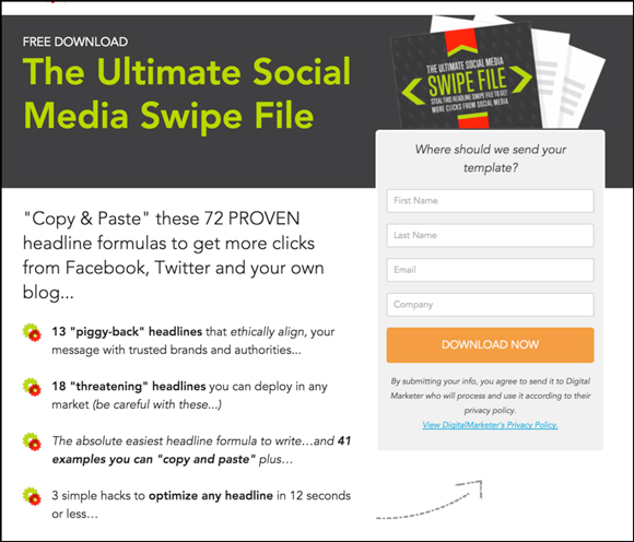 Here’s a bonus tip: Include customer testimonials (text or video) to add social proof. See how Muck Rack has done it on their website.
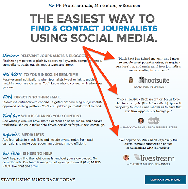
5. Add An Image Of Your Ebook
Humans process visual information much better than any other type of information. In fact, our brain processes images 60,000 times faster than text. This means the first thing your visitors will see on your ebook landing page is the image and the color theme you choose. An eye-tracking study of a page with a baby showed that the image of the baby captured the most attention and the text mostly went unnoticed. Such is the power of a good image! ![]()
![]() So, make sure that your page isn’t all text. Add visual elements to help keep your visitors involved and interested. Include a picture of your ebook to pique your visitor’s interest. It’ll also give your audience a preview of what they’ll download, and will encourage them to take the next step. You can also showcase just one section of your ebook that features exceptional content, such as descriptive infographics, industry research, and expert advice.
So, make sure that your page isn’t all text. Add visual elements to help keep your visitors involved and interested. Include a picture of your ebook to pique your visitor’s interest. It’ll also give your audience a preview of what they’ll download, and will encourage them to take the next step. You can also showcase just one section of your ebook that features exceptional content, such as descriptive infographics, industry research, and expert advice.
6. Use A CTA Button People Can’t Help But Click
What’s the ultimate purpose of your ebook landing page? To entice your leads to take action, right? You want them to download your ebook, don’t you? So, guide them in the right direction by incorporating a strong CTA. No matter how much visitors like your page design, without a strong CTA they may not know how to proceed further. For better conversions, include a CTA that stands out from the rest of your website. This ensures that your visitors are attracted toward that CTA button. Ditch generic CTAs such as “Submit” or “Click here”. Such CTAs aren’t tempting, and they rarely stimulate people to take action. Rather, tell your visitors exactly what will occur if they click your CTA button. Try something like “Download your [Title] ebook now!” This way, your audience knows clearly that by clicking on that button they’ll download your ebook. Let’s take a look at an example. We all know how we fear the pain that comes with cancelling our subscription in case we don’t like a service. Netflix has creatively used its CTA to nip this fear. It clearly mentions that you can “Cancel anytime” above the “Join Free for a Month” CTA. This reassurance is sure to increase their signups. Also, notice that the color of the primary and secondary CTAs matches the red color of Netflix’s logo. ![]()
![]()
7. Create A Short And Relevant Download Form
The most significant element of your page is the download form, where visitors send you their information to download your ebook. Remember, your download form can make or break your conversions. Too long a form and you’ll discourage visitors from downloading your ebook, as they generally don’t want to spend much time filling out forms. They wish to provide very little information and start the download process right away. You can encourage your visitors to convert by creating short forms. Ask for basic information to begin with. You can always follow up later with those leads. It’s a perfect approach to ask for a first name, last name, and an email address. With their email addresses in hand, you can follow up with them and provide more valuable information that benefits them and motivates them to take the next steps. You can also include optional fields in the form, allowing your visitors to input more information if they choose.
Wrap Up
You’re already spending a lot of time and money promoting your ebook on social media and running paid ads, aren’t you? It’s time to put those resources to perfect use. By using the 7 steps above, you can build a compelling ebook landing page to maximize your conversions. The key to creating an effective page that guarantees lead generation is to be ready for incessant testing and improvement. Design and test many different pages to see what works best for you.